

Color psychology is incredibly influential in everything we as humans do today, and while many people assume that we’ve only known about it for a few decades, the reality is that we’ve known about the effects of color on mood for centuries. We know that Ancient Egyptians studied the impact of color for holistic benefits, and ever since, we’ve built on that knowledge, learning how to make the most of it, including to help businesses sell more.
There are few people on the planet who aren’t aware of how major, internationally known brands present themselves—the shape of a logo belonging to a household name is recognizable even if it is shown in a different color. Think of the Adidas or Nike logos, the shape of a Coca-Cola bottle and the “golden arches” symbol of McDonald’s—you know exactly what they look like.
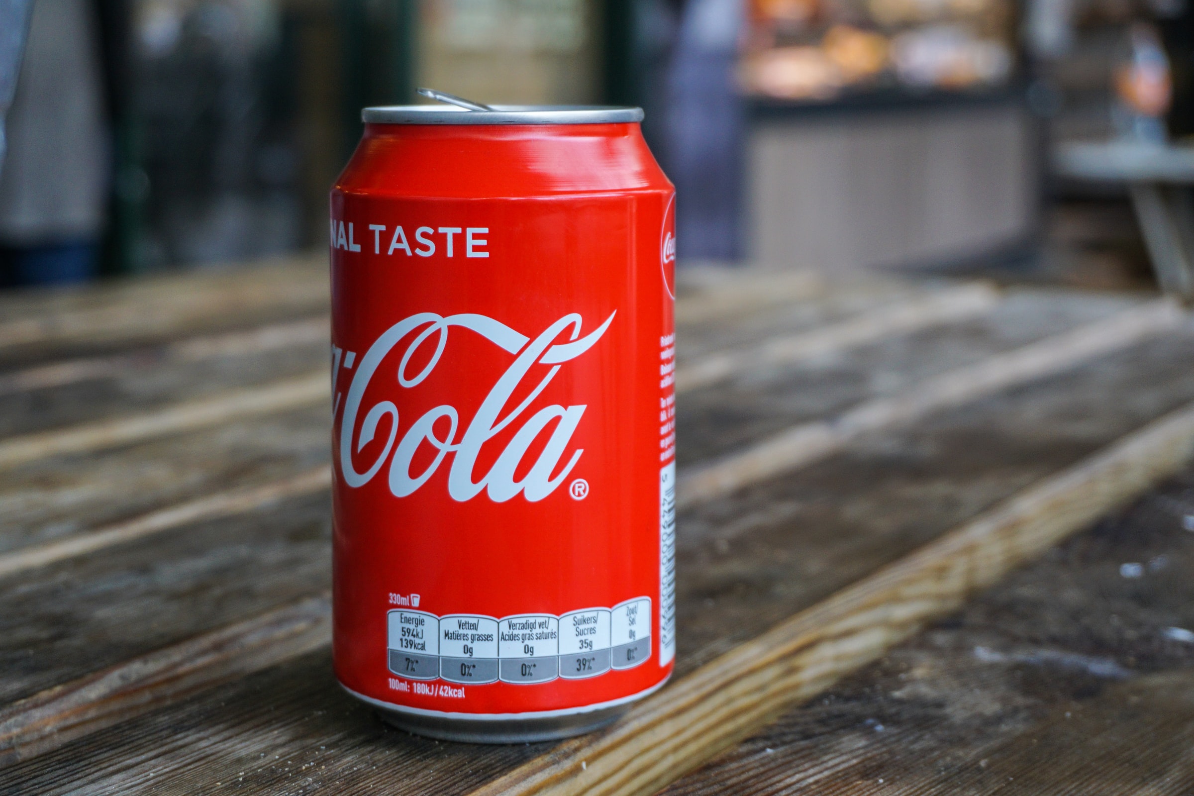
But equally as important to businesses is the color of their branding. What colors do Cadbury, Barbie, and Coca-Cola use for their packaging? Without us even telling you, you are likely to know. (They are purple, hot pink, and red respectively, in case you weren’t sure!) Some colors become ingrained deep in our subconscious—and for those of us with a sweet tooth, seeing the deep purple that Cadbury uses in their branding will make our mouths water, or make our bellies rumble.
But why did those brands choose the colors they did? It certainly wasn’t at random, or because “it looks nice”—it goes way deeper than that. The impact of color on our mood and even our physical bodies is immense, and so is the impact of knowing exactly why brands use each color, and how you can make the most of color in your branding.
Why Is Color Psychology Important?

While humans have known about the impact of color for centuries, color psychology became popular in the 1940s when Kurt Goldstein theorized that colors could have profound physiological reactions, which could impact our attention and focus. As TV and print media became colorized, advertising agencies became aware of the power that color could have on sales, and began funding research to find out more.
Because of this, and ongoing research, color psychology has become widely known, and to ignore the impact of color can be a huge mistake for businesses. It has been found that “people make a subconscious judgment about a person, environment, or product within 90 seconds of initial viewing and that between 62% and 90% of that assessment is based on color alone.”
When thinking about marketing, this tells us that we don’t have long at all to win a person over—it is quite literally less than two minutes, and color plays a huge part in their decisions.
With so much at stake, there is little wonder that some businesses look to ensure that others can’t benefit from their brands, and trademark the particular color that they have chosen. Some of the most famous trademarked colors include:
- Barbie Pink
- Cadbury Purple
- UPS Brown
- Post-It Note Canary Yellow
- Tiffany Blue
When you consider how many imitators these types of businesses encounter, there is little wonder that protecting the success that each color has brought them was high on their agenda. Still, there are thousands of products on the market that mimic these brands by using similar colors, encouraging hundreds of legal cases to be brought, costing businesses millions of dollars.
How Does Color Psychology Work?
The general model of color psychology has six main principles that we can learn from:
- Color can carry a specific meaning
- The meaning of color is either assigned by humans and learnt, or has a biologically innate meaning
- How a color is perceived means a person automatically evaluates a product based on the color
- Certain behaviors will be displayed as a result of evaluating a product based on color
- The influence of color is automatic
- The meaning and effect of color is heavily influenced by the context in which it is encountered
We’re impacted by color all day, every day as we encounter the world around us, and we use those interpretations to help us make sense of the world. It is unsurprising that we use what we have learnt about a color—whether from nature, or as part of our social interactions—to shape our understanding.
Why Is Color Psychology Important for Branding?
We’ve already mentioned how quickly customers make a decision about a business or product. First impressions count for absolutely everything, and that means it is essential for businesses to get their logo and branding materials to say the right thing to their customers instantly.
For international businesses, it is imperative to understand the cultural connotations of color. Take the example of grief, and mourning a loved one—different colors are used for this purpose in different countries.
- In the US, the UK, and much of the western world, black is worn
- In Australia, and some of Eastern Asia, white is often worn
- In South Africa, red is often worn during mourning, while in China, red is forbidden to be worn at funerals as it is a happy color
- In Thailand and some Central and South American countries, purple is worn during the mourning phase
- In Papua New Guinea, grey grass seeds are worn by women after the death of their husband
The use of these colors in your logo and business branding may have a profound impact on your success in different markets. Before moving into new territories, businesses need to understand color connotations, as well as how their name translates—there are numerous examples of names that have potentially embarrassing meanings in different languages.
When you’re choosing colors for your logo and your branding, there are many things to consider alongside what color suggests or is associated with in the country where you’re operating. You’ll also need to consider how your color scheme will look in print, on screen, and anywhere else that your branding will be seen. Your branding needs to be clear and easy to read for customers to understand why you chose that color scheme, and you’ll need to bear in mind that some customers may have visual impairments such as color blindness—how does your branding work for them?
What Do Colors Mean? Connotations of Color
With so many different connotations, it can be hard to know where to start when considering colors for your business branding. In this section, we’ll be talking about how each color is said to impact our senses, as well as the socially accepted connotations of each color in western countries. If you’re planning on using these colors in other territories, you should carry out research to establish whether there are other meanings associated with them.
Psychology of Red
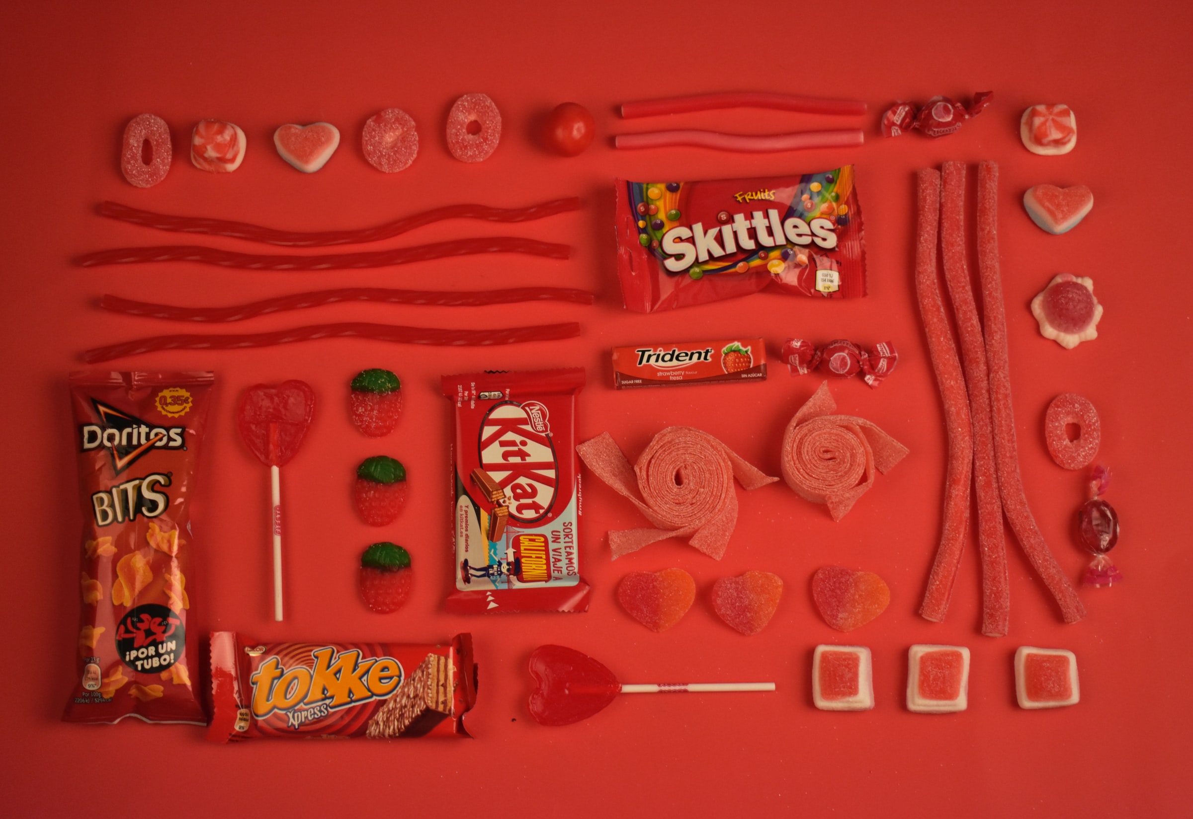
Red is known to be incredibly stimulating, boosting energy levels, releasing adrenaline, provoking sexual desires, hunger, and feelings of bravery. These physiological responses are why many fast food businesses use red in their logos—Coca-Cola, McDonald’s, Pizza Hut, KFC, and Burger King all use red extensively in their branding, to encourage customers to visit and buy.
Negative connotations of red include aggression, anger, and resentment, as well as rebellion. These are likely to be because of over-stimulation of the senses—and drivers of red cars have been found to be more aggressive than others. Bright red is also strongly linked with danger—which is why red is used for warning signs and traffic lights—and heat. Red is also strongly associated with communism, which is definitely something to consider when operating in countries that have been, or still are, under communist regimes.
Psychology of Orange
Because shades of orange tend to have a lot of red in them, orange stimulates the body in a similar way to red, although perhaps not quite as intensely. Enthusiasm, confidence, and courage are all effects that can be seen in the body when encountering orange, as well as hunger and the desire for human interaction—which is why softer orange tones such as peach and terracotta are used in restaurants, to encourage the appetite, and for customers to linger over their meals.
On the negative side, orange is often perceived as being superficial, self-indulgent, and pessimistic, while tones of orange heavily feature naturally during the autumn—so orange is often seen as a color that is associated with transition.
Psychology of Pink

Another color with a lot of red in it, deeper shades of pink are associated with love and romance, while paler shades are seen to be sweeter and calming. Pink is not at all aggressive in nature—in fact, a shade known as "drunk tank pink" has been observed as actively tranquilizing for the body, which is why some prisons are painted this color. Some sports teams have taken advantage of this research, painting their dressing rooms for away teams the bubble gum hue to gain an edge over their opponents.
While the calming effect of pink can be seen as a good thing, it is also associated with physical weakness, emotional neediness, and cautiousness. There are also many socio-political connotations of pink that have different meanings worldwide, so again, do your due diligence before making decisions.
Psychology of Yellow

Yellow stimulates our brains quite profoundly—activating the left brain hemisphere, which is the analytical side, and helping to make decisions more quickly. The bright, sunny hue is strongly linked with sunny days, and is easily picked out from a distance, which is why many warning signs are high contrast, including yellow.
On the negative side, yellow can evoke anxiety and nervousness in the body, and can encourage people to be judgmental—which is definitely not always a good thing when you consider how quickly we make decisions based on color!
Shades of yellow and gold are often used in religious contexts, so as always, do your research before you use yellow in your branding.
Psychology of Green

Green has so many positive connotations, generally around growth and rebirth. As a natural color that is best seen in the spring, that’s not surprising, and businesses that want to imply their sustainability or a link with the environment often turn to green, due to the color being so commonly seen in nature.
Green also has some pretty impressive effects on the body too. It is rejuvenating, helps us to understand situations clearly, and encourages us to become social, evoking our need to belong. Despite that, green has some pretty negative connotations—poison and sickness are amongst the worst, but also jealousy, selfishness, and greed. Definitely not ones to associate your business with.
Psychology of Blue

Blue is an incredibly calming color, known to encourage clear thinking and concentration, as well as helping us to communicate clearly too. Seeing the bright blue of the sky and being by the sea tend to make us feel relaxed, and so it is unsurprising that seeing blue helps us to relax. Because of this perception, blue is seen as a conservative, trustworthy color, often used for uniforms, and in branding, to encourage a feeling of trust in a business.
Despite blue being a relatively positive, calm color, there are some negative emotions that can be experienced when seeing blue—it is often associated with coldness, both in temperature and emotionally, as well as manipulation and unfaithfulness.
Psychology of Purple
As a mix of blue and red, purple has quite the effect on the human body. It can be calming, but depending on the shade can also encourage passion, as well as irritability, impatience, and arrogance.
Historically, purple has been associated with royalty, due to the dyes required to make purple materials being expensive to source. This richness is perhaps why purple has become associated with chocolate—Cadbury, Milka, and Nestle (on Quality Street) have all used shades of purple for their packaging.
There are profoundly different meanings linked with purple around the world. In many countries, such as Japan, purple signifies wealth and privilege. In China, it is linked with spirituality and healing, while in Thailand, women who are mourning their husbands wear purple to show their loss.
Psychology of White

White is seen as linked with cleanliness, and purity—which is used to give an impression of safety, trust, and freshness. This trust can be seen by doctors wearing white coats. The switch was made from dark colors in the late 1800s, to show how the doctor was clean and safe to treat patients, and while any color could be used today, it has been shown that patients trust doctors more when they are wearing a white coat.
There are some negative connotations with white to be aware of. The stark, sterile nature of white is sometimes seen as cold, boring, unimaginative, and bland, and while many brands use white extensively in their marketing, it is well worth doing so carefully.
As always, be careful when you’re using white in your branding—in some Asian countries, white represents death, mourning, and bad luck, due to the requirement of wearing white at funerals. In almost all religions, white is worn extensively, and used to mark sacred locations.
Psychology of Black

Being the darkest of all the colors, black has positive and negative connotations in equal measure. When we consider the little black dress, it is seen as formal and sophisticated, offering strength and comfort, which may also be why many religious elders wear black. There’s also stability in black when we consider “Black Friday”—the day when retailers often begin to make a profit, or can be said to be “in the black.”
On the other hand, black can be depressing, in part due to the connection with mourning in western societies, and there are many uses of black that refer to evil—“the prince of darkness” is a common way to refer to the devil.
Psychology of Grey

Made up of black and white, grey is a great neutral when used in design, and lighter shades tend to be soothing and calming. Grey hair links the shade with maturity, safety and responsibility, and grey hues are often considered to be conservative, dignified, and subdued.
Darker greys are often found to be more solemn, and linked with depression—and since these shades contain more black, that is to be expected. Other negativity to be aware of around grey are the connotations of lifelessness, loneliness and isolation, and boredom.
Psychology of Brown

Shades of brown are generally connected with the color of earth in the ground, as well as trees and autumn leaves. The association with nature makes brown a perfect choice for businesses displaying their environmental credentials, and shades of brown have comforting effects on the body, making us feel safe and secure. Deep shades of brown often have a lot of red in them, giving a luxurious feel to leather (including faux!) goods.
While brown has a lot of positive connotations, there are negative ones too. Brown is often perceived as dull and boring, cheap, and unsophisticated. This is perhaps because undyed natural fabrics tend to be light brown, and while this can be a good thing, cheap and unsophisticated are definitely not words most business owners want associated with their company.
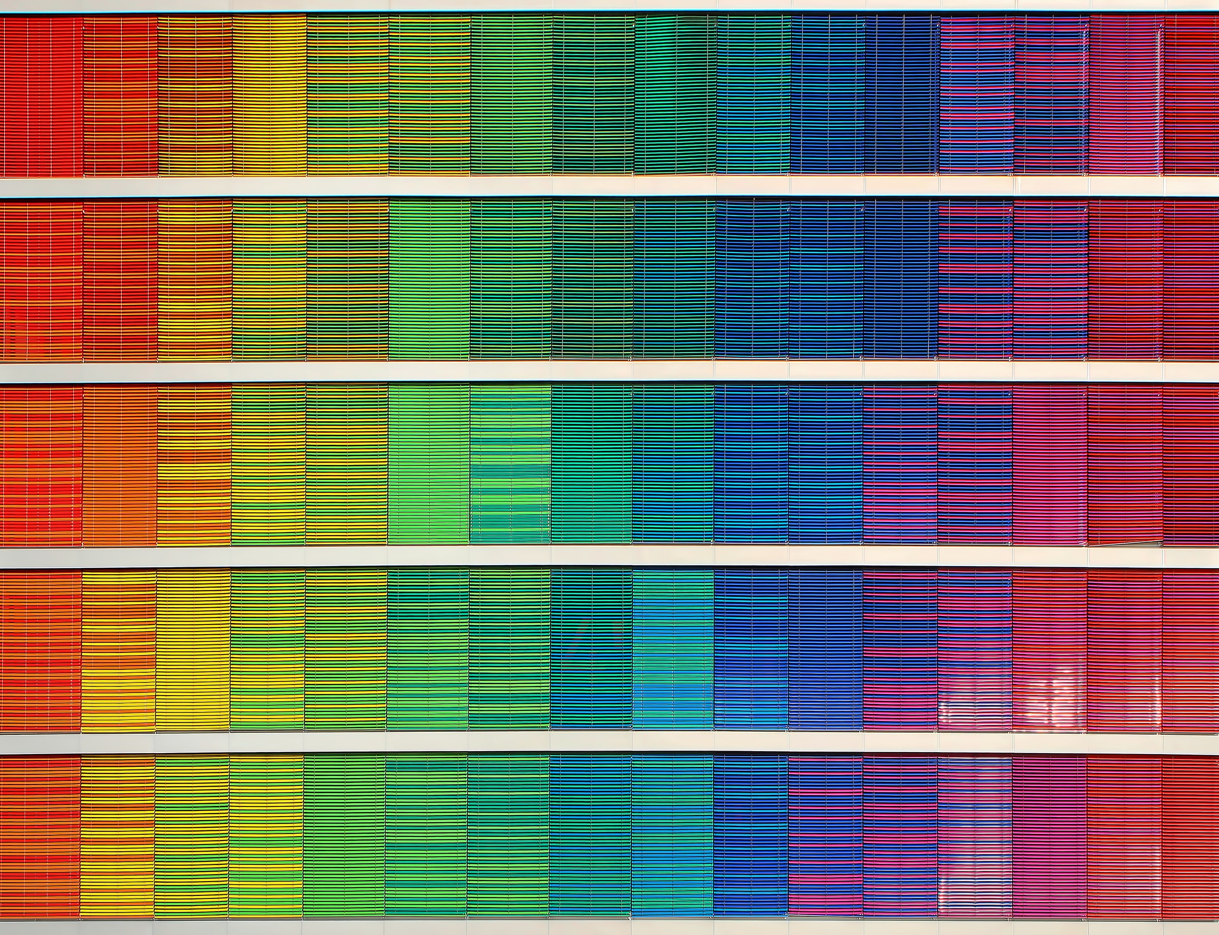
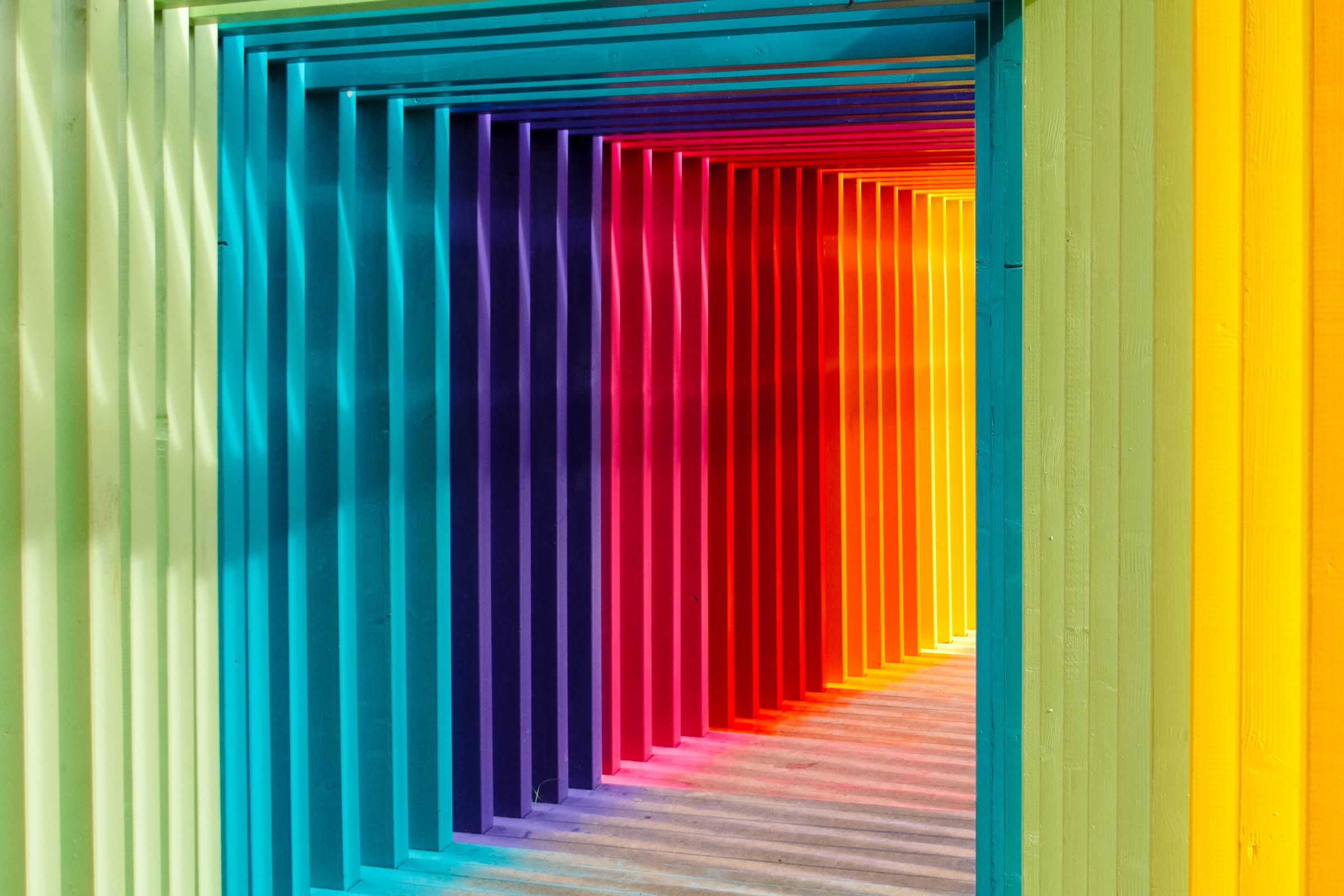
What About Multicolored Branding?
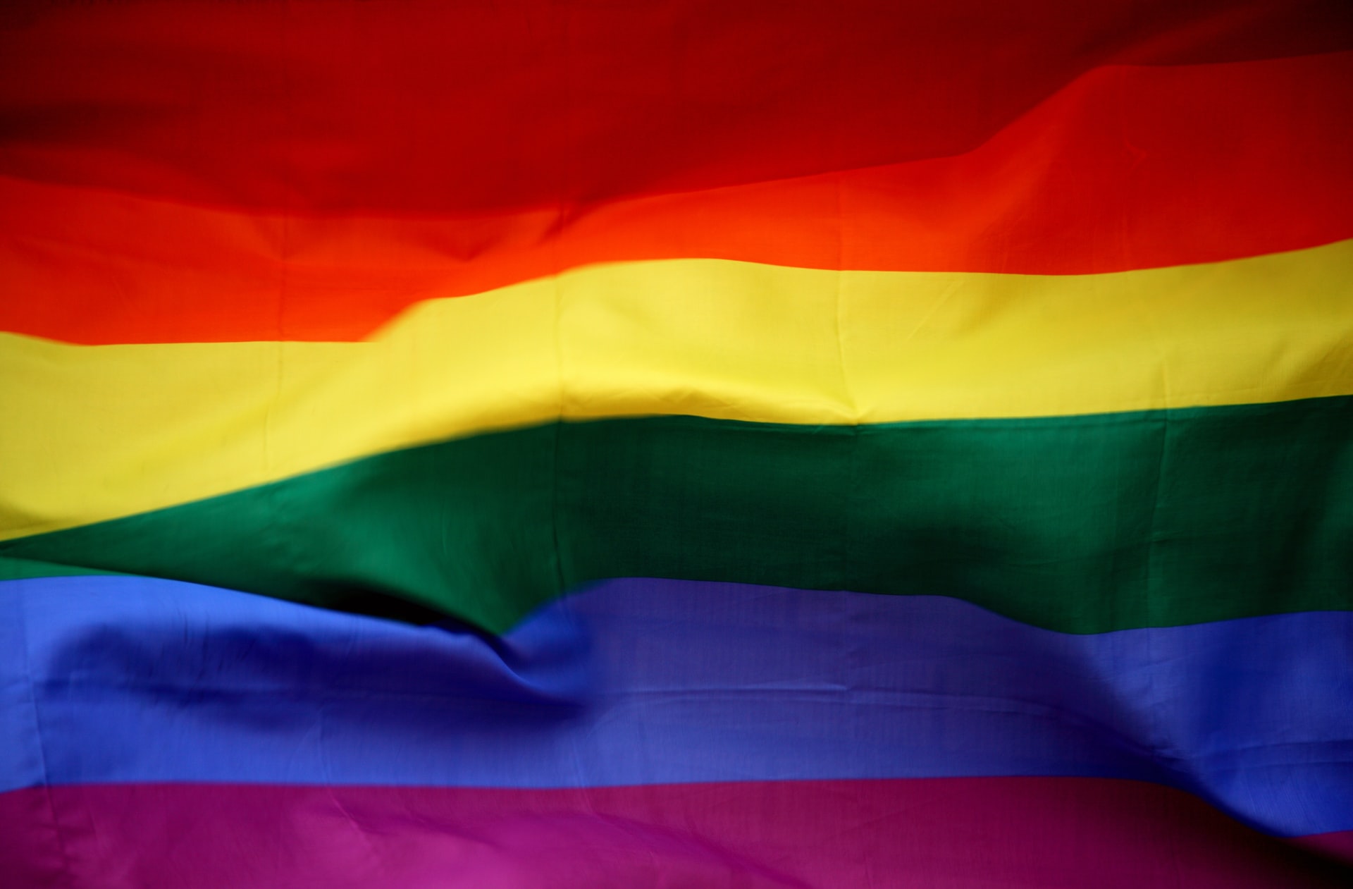
Businesses that use all the colors on the spectrum in their branding often do so with the intention that they are perceived as a fun business, and that their work spans multiple disciplines. This has been done most successfully by Google and Microsoft—both businesses that started with a single aim, but that have grown to encompass far more.
However, rainbow colors have been used throughout history—and use of the rainbow flag has been used for positive reasons such as peace, hope, and social change for centuries before it was adopted by the LGBT+ community in the 1970s. While the rainbow flag has other meanings, companies that use rainbow colors often change their branding in conservative countries, so as not to alienate customers that are unaccepting of LGBT+ lifestyles.
Using Color to Imply Gender
The use of color to denote gender has changed dramatically over the years. Today, pink typically suggests that a baby is a girl, until the 1950s blue was considered much more feminine, and pink a stronger color that little boys tended to be dressed in. This perception was switched during advertising campaigns in the 1950s, which promoted pink as being girly.
This led to the “pink it and shrink it” approach, which used to be the way businesses used to market products towards women. For some years, that worked, but recently, this has been replaced as many in society turn away from traditional gender norms. The popularity of “Millennial Pink” was accredited to the fact that many millennials perceive the color to be “genderless,” and the shade continues to dominate today.
While businesses might be actively marketing to male or female customers, the shift away from “traditional” colors means that using pink or blue could actively drive some customers away. Further, as Generation Z (who are most likely to reject gender norms) become part of the workforce and become more affluent, it becomes even more important to consider color connotations.
Our Final Thoughts
There is a lot to consider when you’re choosing colors for your business—and especially for your logo, and branding materials that customers will encounter first. Even if you’ve chosen a color scheme already, it is well worth taking into account the effects it may have on your customers. Where there are drawbacks to deal with, knowing about them means that you can make changes, or implement additional marketing to keep customers engaged.
If you’re planning to grow your business into a global entity, you need to be even more careful with your branding materials, so be certain to factor these considerations into your brand guidelines. Those first impressions count, and you don’t want to have to deal with a potentially expensive PR nightmare if you accidentally get it wrong—especially when it could be as simple as using a different color logo in territories where your colors have different connotations.
